
Mid-century modern design has stayed popular for one simple reason: it feels fresh, warm, and easy to live with. It is a style that mixes clean lines with natural materials, simple shapes with strong character, and comfort with a sense of order. But if you really want the look to come together, you need the right color choices.
| Category | Colors | Why They Work |
|---|---|---|
| Earthy Neutrals (Base) | Cream, soft beige, warm brown, warm gray, charcoal, ivory, soft white | Form the foundation; complement natural wood tones and create a sophisticated backdrop |
| Warm Accent Colors | Mustard yellow, burnt orange, ochre, brick red, tangerine, gold | Add retro pops of color that “pop” against neutrals; reference natural wood tones |
| Cool Accent Colors | Olive green, sage green, deep blue, teal/turquoise, aqua, duck egg blue, warm blue-gray | Provide contrast to warm wood; create calming or vibrant focal points depending on shade |
| Classic Combos | Black & white, navy + rust + gray, mustard + deep blue, olive + marigold + orange | Timeless Mid-Century pairings that balance drama and warmth |
| Colors to Avoid | Pastels, neon brights, icy gray, stark white, overly cool neutrals | Clash with the style’s warm, earthy, retro aesthetic |
The best mid-century modern home colors usually reflect balance. They bring in earthy warmth, soft neutrals, and a few bold retro tones that give the space personality. That mix is what makes the style feel timeless instead of trendy.
Understanding Mid-Century Modern Design and Its Color Philosophy
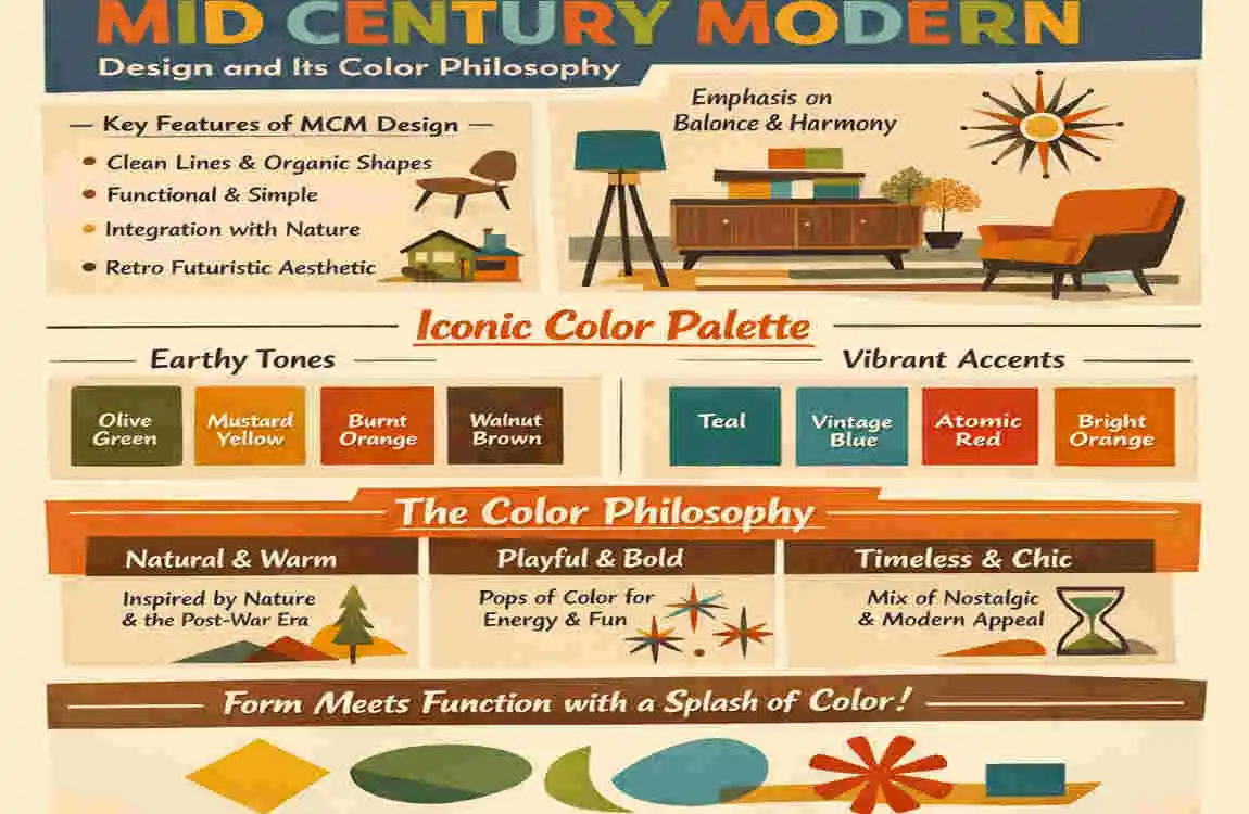
What Defines Mid-Century Modern Style?
Mid-century modern design emerged in the 1940s and continued through the 1970s. It was shaped by a postwar world that sought homes that felt practical, beautiful, and easier to live in. That is why the style focuses on clean lines, functional layouts, and simple forms.
You will often see low-profile furniture, large windows, open rooms, and a strong connection to the outdoors. Instead of heavy decoration, mid-century homes usually rely on shape, material, and color to create interest.
The style also includes organic shapes and natural textures. Wood, stone, leather, and woven fabrics all fit beautifully into the look. This is why color matters so much. The palette has to work with the materials, not compete with them.
Why Colors Matter in Mid-Century Interiors
Color is one of the biggest reasons mid-century homes feel warm instead of cold. These homes often use a mix of natural light, wood tones, and simple architectural forms. The colors you choose need to support that atmosphere.
Warm tones can make a room feel comfortable and lived-in. Cooler tones can keep the space calm and airy. Strong contrasts, such as black and white or walnut and cream, help define the room’s geometry. That contrast is a major part of the style.
In other words, mid-century design colors are not just about looking retro. They help create harmony between the house, the furniture, and the natural world outside.
How Original Homes Used Color
Original mid-century homes often borrowed from Scandinavian design, which favored light, simple, and practical color use. At the same time, they embraced earth-inspired palettes that felt connected to the landscape.
That is why you see so many shades like olive, sand, brown, mustard, rust, and cream in this style. These colors feel grounded and natural.
You also see pops of saturated color in a very controlled way. A mustard chair, a teal wall, or a rust-colored pillow could bring life to a room without overwhelming it. This balance is what makes a retro home color palette feel authentic.
Best Neutral Mid Century Modern Home Colors
Warm White
Warm white is one of the easiest and most flexible choices for a mid-century home. It gives walls a soft, welcoming look without feeling stark or bright. Think ivory, cream, or a gentle off-white rather than a pure bright white.
These shades work especially well when you want the wood in the room to stand out. Walnut, teak, and oak all look richer against a warm white backdrop.
Warm white is also a smart choice if you want the room to feel open and relaxed. It keeps the space light while still offering enough softness to fit the style.
Beige and Sand Tones
Beige and sand colors create a natural base that feels calm and timeless. These tones are ideal if you want your home to feel earthy and grounded.
Warm beige, desert sand, and soft taupe all work well in mid-century spaces because they pair easily with wood furniture and textured fabrics. They also bring a subtle sense of warmth without making the room feel too dark.
If you like a cozy look but still want simplicity, these shades are a strong choice. They are especially helpful in living rooms, bedrooms, and hallways.
Greige and Light Gray
Greige is a blend of gray and beige, and it has become a favorite in many modern homes. In mid-century interiors, it works well because it feels clean but not cold.
Light gray can also be a good option, especially if your space gets a lot of natural light. It helps the room feel fresh and minimal while still letting the furniture shine.
This kind of color is especially helpful in smaller rooms. It keeps the space from feeling heavy and gives you a neutral background for bold furniture or decor.
Charcoal and Deep Gray
Charcoal and deep gray bring more drama into a mid-century space. They are especially useful as accent walls, trim colors, or statement tones in areas where you want strong contrast.
These darker shades look stunning with walnut furniture and brass details. They make the room feel more structured and elegant.
If you want a more refined take on the style, deep gray is a great option. It keeps the home modern while still honoring the vintage mood.
Why Neutrals Work
Neutrals are among the most reliable choices for mid-century modern home colors because they do several jobs at once.
- They create a timeless appearance
- They make styling much easier
- They let vintage furniture and natural textures stand out
- They help the home feel calm and balanced
The best neutral shades for this style are never flat or lifeless. They should feel warm, slightly earthy, and full of quiet character.
Earth Tone Colors Perfect for Mid-Century Modern Homes
Olive Green
Olive green is one of the most classic colors in mid-century design. It brings in a natural, organic feeling that works especially well with wood furniture and indoor plants.
This color is excellent in living rooms and kitchens because it feels grounded but still stylish. It can be used on walls, cabinets, or as a strong accent color.
Olive green gives the home a connection to the outdoors, which is a big part of the mid-century look.
Mustard Yellow
Mustard yellow is one of the most recognizable retro tones. It has warmth, energy, and a little bit of personality without being too loud.
Used well, it adds sunshine and charm to a room. It works beautifully in throw pillows, chairs, rugs, art, and smaller decor pieces.
If you want a color that instantly gives a space a vintage feeling, mustard is a smart pick. It is bold, but it still feels natural in a mid-century home.
Burnt Orange
Burnt orange brings back the feel of the 1960s in a very stylish way. It is warm, rich, and a little dramatic, which makes it perfect for accent pieces.
This color works well in textiles, seating, and decorative objects. It can also be used carefully on an accent wall for a more expressive room.
Burnt orange pairs nicely with cream, walnut, and olive green. Together, they create a look that feels classic and inviting.
Terracotta
Terracotta is one of the most beautiful earthy home color ideas for mid-century spaces. It has a warm, sunbaked quality that feels both rustic and polished.
This color works well in rooms with textured finishes, natural wood, and lots of light. It can make a space feel rich without looking heavy.
Terracotta is also a strong choice for homes seeking a softer, desert-inspired look. It feels organic, warm, and grounded.
Brown and Walnut Shades
Brown shades, especially walnut tones, are deeply connected to mid-century interiors. That is because wood played such a big role in the original style.
When you use brown well, it creates a sense of continuity among the furniture, floors, and walls. It helps everything feel tied together.
Walnut and other medium brown shades are especially useful when you want the home to feel authentic and wood-forward. They are not just colors. They are part of the design’s structure.
Bold Accent Colors That Match Mid Century Modern Style
Teal Blue
Teal is one of the strongest accent colors in a mid-century home. It has enough blue to feel calm, but enough green to feel earthy.
It works well on feature walls, decor, chairs, and even kitchen details. Teal pairs beautifully with walnut, cream, and brass.
If you want a room to feel lively without losing sophistication, teal is a great choice.
Deep Navy
Deep navy gives mid-century spaces a more updated and modern edge. It feels elegant, stable, and slightly dramatic.
This color works especially well in bedrooms, dining rooms, and built-in shelving. It can also look beautiful on cabinetry when paired with light counters or warm wood.
Navy is a smart way to bring in a bold tone while still keeping the room refined.
Avocado Green
Avocado green has strong vintage roots. It is one of those colors that immediately makes people think of the mid-century era.
Used carefully, it can bring real authenticity to the home. It works well in accents, upholstery, and decor.
The key is balance. A little avocado can make the space feel true to the style. Too much can make it feel heavy.
Rust Red
Rust red is warm, rich, and full of character. It brings depth to a space without overpowering it.
This color works well in small doses, especially through textiles, artwork, and accent furniture. It can also help connect a room to other earthy tones, such as terracotta and brown.
Rust red gives the home a slightly more dramatic look while still staying true to mid-century warmth.
Black Accents
Black is one of the most useful tools in mid-century design. It frames shapes, adds structure, and creates contrast.
You can use black in window trim, chair legs, light fixtures, door details, and décor. It helps define the architecture and gives the room a crisp finish.
The trick is to use black as an accent, not the main event. When paired with warm neutrals or wood tones, it looks bold in the best way.
Best Exterior Mid Century Modern Home Colors
White + Black Trim
This is one of the cleanest and most classic looks for a mid-century home exterior. White walls keep the home bright, while black trim adds strong architectural definition.
This pairing works especially well for homes with flat planes, large windows, and simple rooflines. It creates a look that feels sharp, modern, and timeless.
If you want a very polished finish, this is one of the safest and most attractive combinations.
Beige + Walnut Wood
Beige and walnut wood create a soft, natural exterior that feels warm and welcoming. This combination works especially well if your home has wood siding, wood accents, or a lot of natural materials.
It gives the house an organic appearance that blends nicely with landscaping. The look is subtle, but it still feels rich.
This is a good option if you want your exterior to feel calm rather than dramatic.
Olive + Stone Gray
Olive and stone gray make a strong nature-inspired pair. They feel grounded and modern at the same time.
This combination works especially well in homes surrounded by trees, rock, or greenery. It helps the home settle into the landscape rather than stand apart from it.
For a modern retro house exterior, this is a beautiful choice that feels both fresh and classic.
Charcoal + Cedar
Charcoal and cedar create a more dramatic exterior with a high-end look. The dark gray gives structure, while cedar warms the design with natural color and texture.
This combination works well on homes that want a contemporary feel while still staying rooted in mid-century design. It feels elegant without being flashy.
If you want your exterior to feel strong and stylish, this pairing is worth considering.
Terracotta + Cream
Terracotta and cream give the exterior a desert-inspired personality. This color story feels sun-warmed, inviting, and retro in the best way.
It is especially effective in dry or sunny climates. Still, it can also work beautifully anywhere if balanced with stone, wood, or greenery.
This pairing is ideal if you want your home to stand out while still feeling warm and approachable.
Key Considerations
Before choosing your exterior palette, think about these important details:
- Roof color
- Landscaping
- Sun exposure
- Material finishes
A color that looks perfect in a sample can feel very different once it is on the whole house. Always look at the full setting, not just the paint swatch.
Room-by-Room Color Guide for Mid Century Modern Interiors
Living Room Colors
The living room is often the best place to express the full mid-century look. It is where the style can feel warm, inviting, and lived-in.
Olive green is a strong choice here because it blends well with plants, wood, and soft lighting. Cream walls can keep the room open and bright. Burnt orange accents, such as pillows or chairs, add energy without making the room too loud.
If you want the room to feel balanced, use a neutral base and let the accent colors do the talking.
Kitchen Colors
Mid-century kitchens often work best with simple, functional colors. You want the space to feel clean, but not sterile.
Walnut brown, white cabinets, and muted teal are a classic mix. Walnut gives the kitchen warmth, white keeps it fresh, and muted teal adds a little personality.
If you want a stronger retro feeling, consider adding mustard or olive through small details like stools, dishes, or artwork.
Bedroom Colors
Bedrooms should feel restful, and mid-century colors can help create that calm atmosphere. Dusty blue, warm gray, and beige are especially good choices.
Dusty blue gives the room softness. Warm gray keeps it grounded. Beige adds a gentle, cozy feeling that works well with wood beds and simple linens.
A bedroom does not need bold color to feel stylish. In fact, softer tones often work better here because they encourage relaxation.
Bathroom Colors
Bathrooms can feel very elegant in a mid-century home when the color palette is kept simple and clean.
Sage green, soft ivory, and black accents make a strong combination. Sage brings in a natural touch. Ivory keeps the space bright. Black gives it shape and contrast.
If your bathroom is small, lighter shades are especially helpful because they make the room feel more open.
Dining Room Colors
Dining rooms are a great place to experiment a little more with bold mid-century tones. Mustard, rust, and wood-heavy contrasts can make the room feel full of character.
These colors work especially well when paired with a simple table and classic chairs. The room feels warm, social, and slightly nostalgic.
The dining room is also a good place to use a stronger color if you do not want it in the rest of the house.
How to Combine Mid-Century Modern Colors Effectively
Follow the 60-30-10 Rule.
One of the easiest ways to build a strong color palette is to use the 60-30-10 rule.
- 60% should be your dominant neutral
- 30% should be your secondary warm shade
- 10% should be your accent pop
This rule helps the room stay balanced. It keeps the space from feeling too plain or too busy.
For example, you might use cream walls, walnut furniture, and a mustard chair. That combination feels classic and easy to live with.
Balance Warm Wood Tones
Wood is one of the most important parts of mid-century design. Walnut, teak, and oak all bring natural warmth into the home.
When you use color, think about how it will look next to the wood already in the room. Some shades make wood richer, while others can make it feel flat.
Earth tones and soft neutrals usually work best because they let the wood remain visible and important.
Use Contrast Carefully
Contrast is a big part of the style, but it should never feel harsh. Black, brass, and white can all create a strong visual structure when used effectively.
The goal is not to make everything pop at once. The goal is to guide the eye.
A black lamp, a brass handle, or a dark frame can be enough to complete the room without overdoing it.
Avoid Overcrowding Colors
Mid-century design is simple at heart. That means too many colors can quickly break the feeling.
If you love several shades, try grouping them by tone. For example, earth tones can live together beautifully. Or you can use one neutral base and add just one bold accent.
Simplicity is not about being boring. It is about making each color choice matter.
Colors to Avoid in Mid-Century Modern Homes
Neon Shades
Neon colors usually feel too sharp and too modern for this style. They can overwhelm the softness and warmth that mid-century design needs.
A bright neon green or electric pink may feel exciting for a moment, but it usually breaks the vintage mood.
If you want energy, choose a rich retro tone instead, such as mustard or rust.
Ultra Glossy Metallics
Some metallic finishes can feel too flashy in a mid-century space. Very glossy silver or high-shine gold can overpower the room, making it feel less grounded.
The style works better with softer, brushed, or matte finishes. These look more balanced and natural.
Cool Sterile Whites
A very bright, icy white can feel too clean and cold. It can take away the warmth that makes mid-century homes so inviting.
If you want white walls, choose a warmer version instead. Soft ivory or creamy off-white usually works much better.
Overly Busy Multicolor Schemes
Too many colors can make the home feel scattered. Mid-century design relies on structure and clarity to avoid visual clutter that can weaken the style.
This is why it is better to choose a few strong colors and repeat them thoughtfully. That creates flow and makes the home feel intentional.
Popular Mid Century Modern Color Palette Ideas
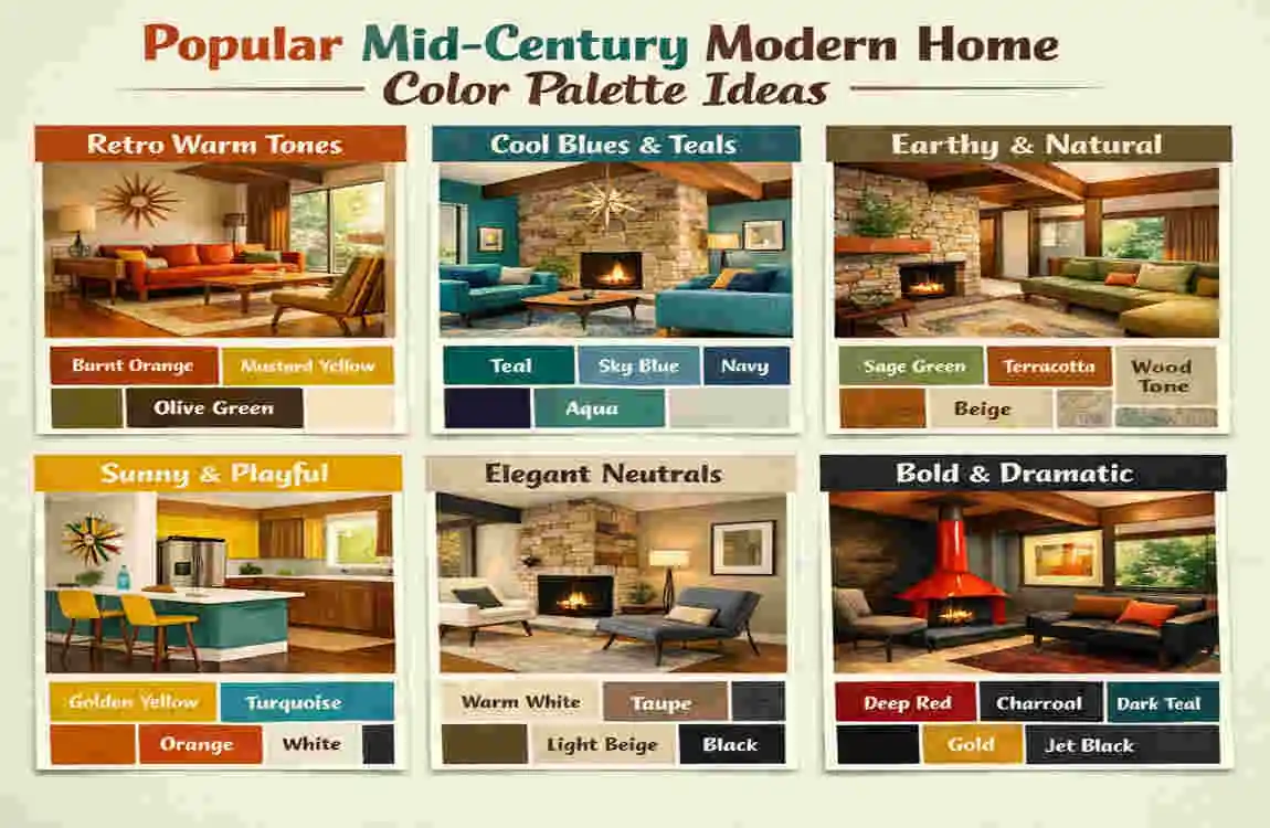
Palette Name, Main Colors, Best For, Overall Mood
Classic Retro Warmth Mustard yellow, walnut brown, olive green, cream Living rooms, dining rooms Cozy, nostalgic, inviting
Scandinavian Mid Century Blend Soft gray, white, light oak, dusty blue Bedrooms, kitchens Calm, airy, minimal.
Desert Modern Terracotta, sand beige, charcoal, rust Exteriors, open-plan interiors Warm, grounded, sun-washed
Minimal Luxe Black, white, walnut, taupe. Sophisticated interiors. Clean, elegant, refined
Classic Retro Warmth
This palette feels like a true nod to the era. Mustard yellow, walnut brown, olive green, and cream work together to create a rich and welcoming mood.
It is ideal if you want your home to feel vintage, but still easy to live with.
Scandinavian Mid Century Blend
This mix leans more toward restraint and airiness. Soft gray, white, light oak, and dusty blue create a peaceful look that feels both modern and timeless.
It is a strong choice for smaller homes or rooms that need more light.
Desert Modern
Terracotta, sand beige, charcoal, and rust bring in a warm, sunbaked feeling. This palette is perfect for anyone who wants a more earthy version of mid-century style.
It works especially well when you want the home to feel connected to natural surroundings.
Minimal Luxe
Black, white, walnut, and taupe create a cleaner, more polished take on the style. This palette is understated, but it still has a lot of character.
It is ideal if you prefer a more refined and modern version of mid-century design.
Tips for Choosing the Right Mid-Century Modern Home Colors
Consider Natural Light
Natural light changes everything. A color that looks soft and warm in one room may look dull or too dark in another.
East-facing rooms often feel cooler in the morning, so warm tones can help warm them up. Dark spaces usually need lighter colors to avoid feeling closed in.
Always think about how the sun moves through the space during the day.
Match Existing Furniture
If you already own teak, leather, walnut, or other mid-century pieces, let those items guide your color choices.
Furniture sets the tone. Your wall and accent colors should support it, not fight with it.
This is one of the easiest ways to make sure your room feels cohesive.
Think About Mood
Color influences how a room feels. Warm colors tend to feel cozy, social, and inviting. Cool colors often feel calm, quiet, and fresh.
Ask yourself what you want the room to do. Do you want it to energize you? Help you relax? Feel formal? Feel open?
Once you know the mood, choosing the right color family becomes much easier.
Test Paint Swatches First
Never choose a color based on a tiny sample alone. Paint a few test patches on the wall and watch them throughout the day.
Colors change with light, shadows, furniture, and even the time of year. A swatch can look very different in the full room.
Testing first saves time, money, and frustration.
Frequently Asked Questions
What are the most popular mid-century modern home colors?
Some of the most popular mid-century modern home colors include olive green, mustard, walnut brown, white, and burnt orange. These shades reflect the warmth, earthiness, and retro charm of the style.
Are bold colors good for mid-century homes?
Yes, bold colors can work very well, especially as accents. The key is to balance them with neutral walls or natural wood so the room still feels calm and structured.
Is black suitable for mid-century modern interiors?
Absolutely. Black is often used to frame architecture, highlight furniture, and create contrast. It works best when used in small but thoughtful amounts.
Can modern gray work in mid-century design?
Yes, especially warm gray. A cooler gray can sometimes feel too plain, but a softer gray or greige can blend beautifully with wood and vintage furniture.
What exterior color works best?
The best exterior colors often include white, charcoal, olive, beige, and cedar tones. The right choice depends on the roof, the landscaping, and the amount of natural light the home receives.