
Mid-century modern home paint colours are loved for their clean, warm, and timeless feel. This style mixes simple shapes with natural colours and a few bold accents. If you want your home to look stylish without feeling busy, this is a great place to start.
The right paint colour can do a lot. It can make your home look brighter, more welcoming, and more balanced. It can also bring out the best in your home’s design, whether you are working on the exterior or the interior.
Understanding Mid-Century Modern Colour Palettes
The History of Mid-Century Modern Colours
Mid-century modern design became popular in the mid-20th century. It focused on simple lines, practical spaces, and a connection to nature. That is why the colours often came from the world around us.
Think of warm woods, soft whites, muted greens, and earthy browns. These shades helped homes feel calm but still interesting. Bright colours were also used, but usually as accents rather than covering everything.
Why Paint Colours Matter in Mid-Century Design
Paint is one of the easiest ways to bring this style to life. The wrong colour can make a home feel flat or too modern in the wrong way. The right colour, however, can highlight the style’s best features.
For example, a soft cream wall can make walnut furniture stand out. A bold teal front door can give a plain exterior a retro feel. Small choices like these create a big visual impact.
Key Characteristics of Mid-Century Modern Homes
Most mid-century modern homes share a few design traits:
- Clean lines
- Large windows
- Flat or low-pitched roofs
- Open layouts
- Natural materials like wood and stone
Because of these features, paint colours should feel balanced rather than heavy. The goal is to support the architecture, not overpower it.
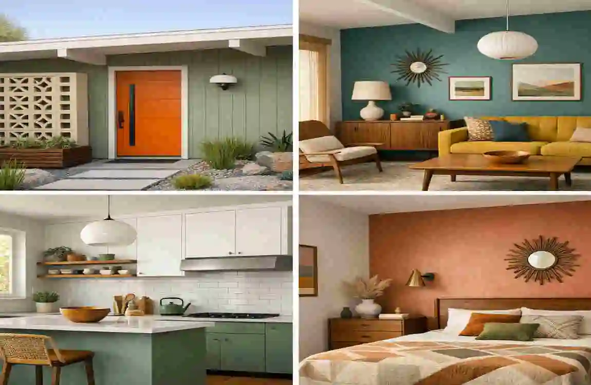
Popular Mid-Century Modern Home Paint Colours
Warm White
Warm white is one of the safest and best choices. It feels soft, bright, and timeless. Unlike a harsh white, it adds warmth to the room or exterior.
Mustard Yellow
Mustard yellow brings a true retro feel. It works well as an accent colour on a front door, a chair, or a kitchen wall. It adds energy without feeling too loud.
Olive Green
Olive green is a classic mid-century shade. It feels earthy, rich, and calm. It works beautifully with wood, black trim, and cream walls.
Burnt Orange
Burnt orange adds warmth and character. Use it carefully, because it is strong. It works best as an accent in small doses.
Teal Blue
Teal blue is bold but still stylish. It pairs well with walnut wood, white walls, and brass details. Many homeowners use it for doors, cabinets, or one accent wall.
Charcoal Gray
Charcoal grey adds a modern edge to a home. It is a good choice for exteriors, trim, or statement walls. It looks especially nice when paired with natural wood.
Earthy Brown
Earthy brown connects the home to nature. It works well in spaces with wood beams, stone details, or vintage furniture.
Sage Green
Sage green is softer than olive and feels peaceful. It works well indoors and outdoors, especially if you want a relaxed, natural look.
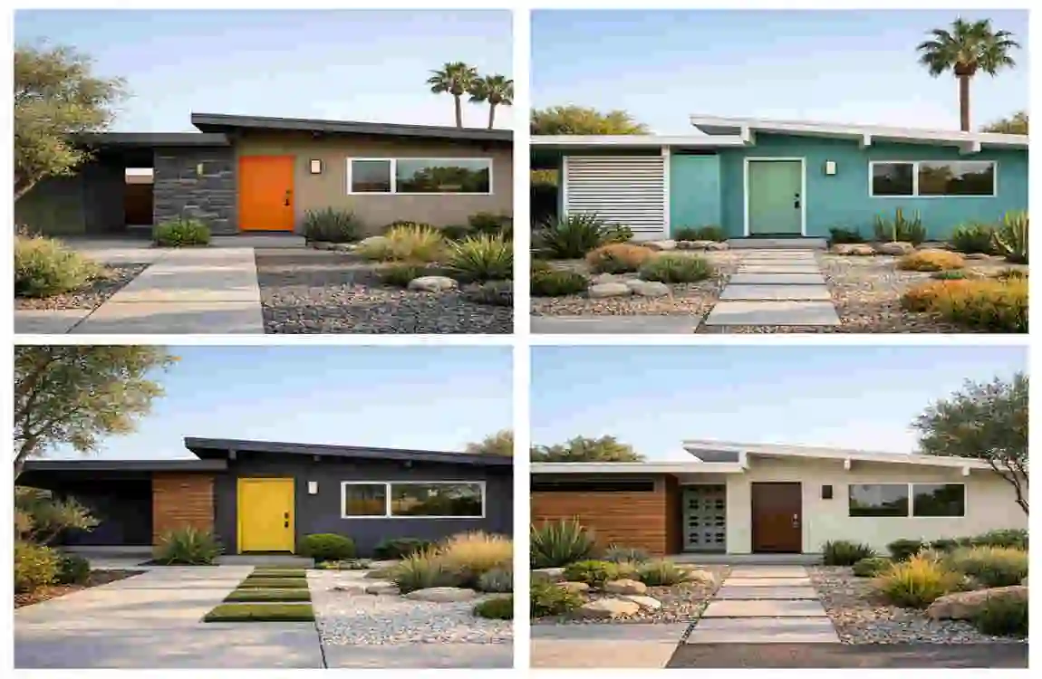
Best Exterior Mid-Century Modern Home Paint Colours
Neutral Colour Schemes
For the outside, neutral shades are often the best starting point. Cream, warm white, light grey, and taupe work well because they let the home’s shape stand out.
These colours also create a clean base for bold accents. That balance is important in mid-century design.
Bold Accent Colours
A bold front door or trim colour can make the whole home feel more authentic. Teal, mustard, orange, or deep green are popular choices.
If your exterior is simple, one strong accent can give it personality without making it feel overdone.
Wood and Paint Combinations
Wood and paint are a perfect match in this style. Natural wood siding, posts, or shutters bring warmth, while paint adds contrast.
A common choice is warm-white walls with walnut accents. Another strong look is charcoal trim with natural wood panels. These combinations feel classic and rich.
Desert-Inspired Colour Palettes
Many mid-century homes fit naturally into desert-inspired palettes. Think sand, clay, sage, rust, and stone.
These shades feel calm and grounded. They also work well in sunny climates where soft earth tones blend beautifully with the landscape.
Best Interior Mid-Century Modern Paint Colours
Living Room Ideas
Living rooms should feel open and welcoming. Warm white, beige, sage green, and soft grey are all strong choices.
If you want more personality, add a single accent wall in olive or teal. That gives the room character without making it feel crowded.
Bedroom Colour Inspiration
Bedrooms work best with calm colours. Soft green, dusty blue, cream, and warm taupe help create a restful space.
These shades support the mid-century style while keeping the room peaceful and simple.
Kitchen Paint Trends
Mid-century kitchens often look best with a mix of clean neutrals and bold accents. White cabinets with wood details are a classic choice.
If you want more colour, try teal lower cabinets, mustard stools, or olive walls. Just keep the overall look balanced.
Bathroom Colour Combinations
Bathrooms are a great place to use soft colours. Sage green, warm white, charcoal, and pale blue can all work well.
Small rooms often look better with lighter shades, but a dark vanity or accent wall can add a stylish retro touch.
Trending Mid-Century Modern Colour Combinations
White and Walnut
This is one of the most timeless combinations. The white keeps things light, while walnut adds richness and warmth.
Teal and Mustard
This pair feels bold and playful. It is a great choice if you want a more vintage look with personality.
Olive and Cream
This combination feels soft, earthy, and balanced. It works especially well in living rooms and exteriors.
Grey and Orange
Grey gives structure, while orange adds energy. This pairing is ideal for accent pieces or feature walls.
Beige and Black
Beige and black create a clean, modern contrast. This look is simple, sharp, and easy to style.
How to Choose the Right Mid-Century Modern Paint Colours
Consider Natural Lighting
Light changes how paint looks. A colour that feels warm in one room may feel dull in another. Always check the light at different times of day.
Match Existing Architectural Features
Look at your home’s windows, wood trim, brick, or stone. Your paint should work with these features, not fight against them.
Coordinate With Furniture and Décor
If you already own mid-century furniture, use it as a guide. Walnut, teak, brass, and leather all pair beautifully with earthy colours and soft neutrals.
Test Paint Samples First
Never skip the test step. Paint small samples on your wall or exterior and observe them for a few days. This helps you avoid costly mistakes.
Simple Tips for Better Results
- Start with a neutral base
- Use bold colours only as accents
- Repeat one colour in different parts of the home
- Keep the palette limited for a cleaner look
Common Mistakes to Avoid
Using Too Many Bright Colours
Mid-century style uses colour with purpose. Too many bright shades can make the home feel chaotic instead of stylish.
Ignoring Architectural Details
The best paint colours should highlight your home’s design. If you ignore trim, windows, or wood features, the final look may feel flat.
Choosing Trendy Colours Over Timeless Ones
Trendy colours can look outdated quickly. If you want long-term appeal, choose shades that feel natural, balanced, and classic.
Budget-Friendly Ways to Refresh Your Home With Paint
Accent Walls
An accent wall is one of the easiest ways to update a room. It adds interest without requiring a full repaint.
Front Door Updates
Painting the front door is a small project with a big payoff. A bold door colour can instantly improve curb appeal.
Cabinet Makeovers
If your kitchen feels tired, paint the cabinets instead of replacing them. This can completely change the mood of the room.
DIY Painting Tips
Take your time, use good painter’s tape, and apply thin coats. A careful paint job always looks better than a rushed one.
Expert Tips for a Cohesive Mid-Century Modern Look
Mixing Natural Materials
Pair paint with wood, leather, stone, or woven textures. These materials help the colours feel warm and authentic.
Incorporating Vintage Elements
Mid-century furniture, simple lighting, and retro decor can support the paint colours and make the whole space feel more complete.
Maintaining Balance Between Retro and Modern
You do not need to make your home feel like a time capsule. The best look blends retro charm with modern comfort.
FAQ
What are the most popular mid-century modern home paint colours?
The most popular choices are olive green, mustard yellow, teal blue, burnt orange, warm white, charcoal grey, and earthy brown.
What exterior colours work best for mid-century modern homes?
Neutral shades with bold accents work best. Warm white, cream, light grey, and taupe are strong base colours, while teal, mustard, and deep green work well for doors or trim.
Can I use bright colours in a mid-century modern home?
Yes, but use them carefully. Bright colours work best as accents, not as the main colour throughout the whole home.
Are earth tones suitable for mid-century modern interiors?
Absolutely. Earth tones like olive, beige, brown, and terracotta are a natural fit for this style.
How do I choose the right mid-century modern home paint colours?
Look at your lighting, furniture, and architecture first. Then test a few samples before making your final choice.
What colour combinations are trending for mid-century modern homes?
Popular combinations include olive and cream, teal and mustard yellow, charcoal grey and orange, and white with natural wood finishes.
| Paint Color Idea | Description | Best Use |
|---|---|---|
| Warm White | Clean and timeless with subtle warmth | Exterior walls, living rooms |
| Sage Green | Nature-inspired and calming | Exterior siding, accent walls |
| Mustard Yellow | Bold retro color popular in mid-century design | Front doors, décor accents |
| Teal Blue | Vibrant and stylish vintage look | Accent walls, entryways |
| Charcoal Gray | Modern contrast with classic appeal | Exterior trim, garages |
| Olive Green | Earthy tone that complements natural materials | Exterior façades, feature walls |
| Terracotta | Warm, organic color with a retro feel | Accent areas, outdoor spaces |
| Walnut Brown | Inspired by mid-century wood furniture | Trim, doors, paneling |
| Soft Beige | Neutral and welcoming | Whole-house interiors |
| Burnt Orange | Iconic mid-century modern accent color | Doors, feature walls, décor |